Preliminary model combining teleseismic and GPS data
02/27/2010 (Mw 8.8), Chile
Anthony Sladen (Caltech), Susan Owen (JPL-Caltech)
Location of Epicenter |
Amount of Slip on Fault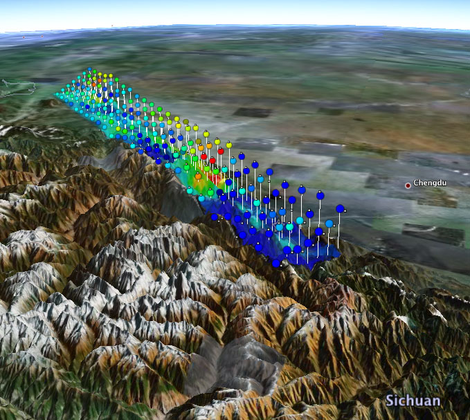
View in Google Earth (requires Google Earth) Colors show the amount of slip on diferent sections of the fault zone. Two views are shown (either view can be de-selected on the Google Earth sidebar):
|
DATA Process and Inversion
Fault parametrisation
The epicenter location is based on the USGS estimate (Lon.=-72.719 ° Lat.=-35.846 ° depth=35 km). The focal mechanism is taken from the GCMT solution (strike=18 °, dip=18 °) and the 1D velocity model is extracted from the CRUST2.0 global tomography model (Bassin et al., 2000). The kinematic slip model is based on GSN broadband data downloaded from the IRIS DMC and GPS measurements from IGS stations.Teleseismic data
We analyzed 24 teleseismic P waveforms selected based upon data quality and azimuthal distribution. Waveforms are first converted to displacement by removing the instrument response and then used to constrain the slip history based on a finite fault inverse algorithm (Ji et al, 2002).GPS data
Ground displacements measured at IGS stations were incorporated in the inversion. SANT (Santiago) and CONZ (Conception) are kinematic solutions using 30s data and JPL high-rate clocks and precise orbits. All other stations are daily solutions using JPL rapid orbits. The processing was done by Susan Owen (Jet Propulsion Laboratory).Result
The solution is made of one major slip patch stretched about 20 km west and updip from the epicenter. The slip is mostly left-lateral, with a significant component of thrust motion.Map view of the slip distribution
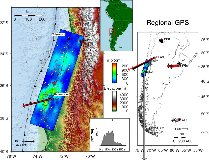
Figure 1: Surface projection of the fault plane slip distribution at the local (left figure) and region scale (right figure). GPS data are plotted as black vectors; synthetic GPS vectors are in grey (vertical component) and red (horizontal component). The red star represents the epicenter of this event. The white dots are aftershocks located by USGS.
Comparison of data and synthetic seismograms
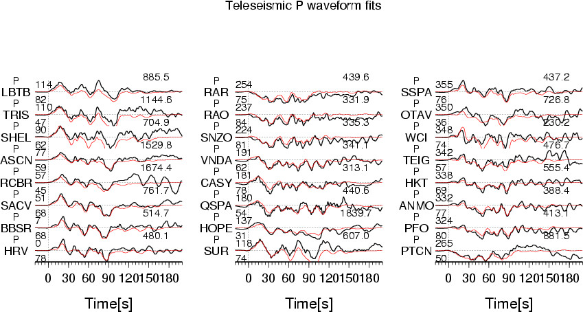
Figure 2: The Data are shown in black and the synthetic seismograms are plotted in red. Data are aligned on the theoretical P-wave arrival (IASPEI earth model). The number at the end of each trace is the peak amplitude of the observation in micro-meter. The number above the beginning of each trace is the source azimuth and below it is the epicentral distance.
Map view of the surface deformation
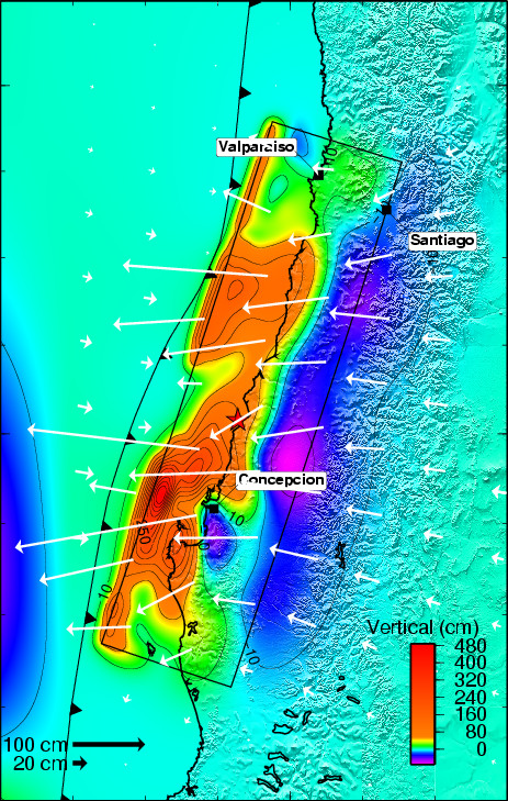
Figure 3: Surface deformation predicted from the slip model. The vertical component of displacement is given by the color scale, and the horizontal motion by the arrows.
Comments:
The directivity effect visible in the observed waveforms (equivalent to a Doppler effect) suggests that the rupture propagated mostly to the north (pulses arrive earlier in that direction). If the rupture propagated at similar speeds north and south of the epicenter this would be an indication that the north segment released more energy. However, if the south segment released more energy, as suggested by this prelimiary source model, it could be that the rupture was much slower or delayed to the south.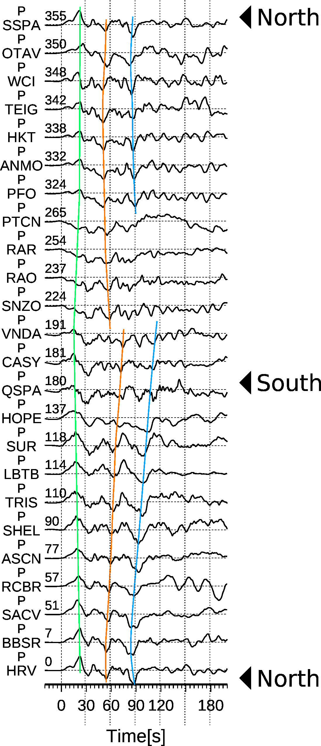
Figure 4: Teleseismic P waveforms sorted by azimuth (number on the left).
Download
| SUBFAULT FORMAT | CMTSOLUTION FORMAT | SOURCE TIME FUNCTION |
References
Ji, C., D.J. Wald, and D.V. Helmberger, Source description of the 1999 Hector
Mine, California earthquake; Part I: Wavelet domain inversion theory and resolution
analysis,
Bassin, C., Laske, G. and Masters, G., The Current Limits of Resolution for
Surface Wave Tomography in North America, EOS Trans AGU, 81, F897, 2000.
GCMT project: http://www.globalcmt.org/
USGS National Earthquake Information Center: http://neic.usgs.gov