Preliminary Result
11/15/2006 (Mw 8.3), Kuril islands
Anthony Sladen, Caltech
Location of Epicenter |
Amount of Slip on Fault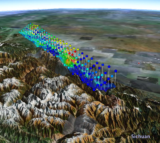
View in Google Earth (requires Google Earth) Colors show the amount of slip on diferent sections of the fault zone. Two views are shown (either view can be de-selected on the Google Earth sidebar):
|
DATA Process and Inversion
We used the GSN broadband data downloaded from the IRIS DMC. We analyzed 28 teleseismic P waveforms and 25 teleseismic SH waveforms selected based upon data quality and azimuthal distribution. Waveforms are first converted to displacement by removing the instrument response and then used to constrain the slip history based on a finite fault inverse algorithm (Ji et al, 2002). We use the epicenter location of the USGS (Lon.=153.23° Lat.=46.607°), while the dip angle (15°) is taken from the GCMT solution. The strike (220°) is adjusted to align with the orientation of the trench. The 1D velocity model is extracted from the CRUST2.0 global tomography model (Bassin et al., 2000). The depth of the epicenter is fixed at 20 km, and the rupture velocity is assumed to be about 2.0 km/sec.Result
The solution is made of several slip patches but with most of the slip occurring up-dip of the epicenter (Figure 1) and stretched parallel to the trench over approximately 60 km. The slip is oriented normal to the strike of the fault. As can be seen from the seismograms (Figure 2) and the inverted source time function (Figure 3), the energy of the earthquake was mainly released in three episodes, at 25, 45 and 80 seconds. The first pulse is the only one to not have its energy spreaded over an isochrone, and is thus likely to be the only one robustly located relative to the hypocenter.Cross-section of slip distribution
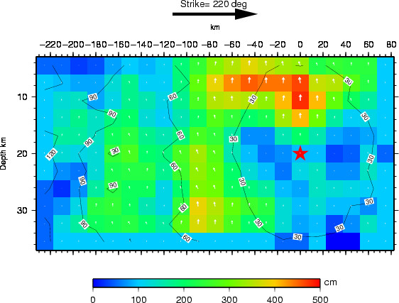
Figure 1: The big black arrow shows the fault's strike. The colors show the slip amplitude and white arrows indicate the direction of motion of the hanging wall relative to the footwall. Contours show the rupture initiation time and the red star indicates the hypocenter location.
Comparison of data and synthetic seismograms
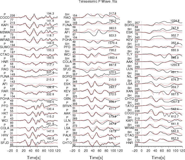
Figure 2: The Data are shown in black and the synthetic seismograms are plotted in red. Both data and synthetic seismograms are aligned on the P arrivals. The number at the end of each trace is the peak amplitude of the observation in micro-meter. The number above the beginning of each trace is the source azimuth and below it is the epicentral distance.
Map view of the slip distribution
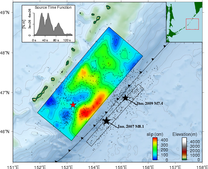
Figure 3: Surface projection of the slip distribution. The small black dots represent the aftershocks located by USGS-NEIC from the time of the earthquake to the Mw=8.1 normal fault event of January 13, 2007. The bathymetric contours are plotted in light grey every 1000 meters.
Comments:
Download
| SUBFAULT FORMAT | CMTSOLUTION FORMAT | SOURCE TIME FUNCTION |
References
Bassin, C., Laske, G. and Masters, G., The Current Limits of Resolution for
Surface Wave Tomography in North America, EOS Trans AGU, 81, F897, 2000.
Ji, C., D.J. Wald, and D.V. Helmberger, Source description of the 1999 Hector
Mine, California earthquake; Part I: Wavelet domain inversion theory and resolution
analysis,
GCMT project: http://www.globalcmt.org/
USGS National Earthquake Information Center: http://neic.usgs.gov
Global Seismographic Network (GSN) is a cooperative scientific facility operated jointly by the Incorporated Research Institutions for Seismology (IRIS), the United States Geological Survey (USGS), and the National Science Foundation (NSF).